TVNET
TV Branding Total Package (2007)
About Project
The brief that we received from the channel management clearly defined their requirement for a plain and legible, yet distinctive logo.
Therefore, we built the whole idea around a simple font and the distinctive power of the colour yellow.
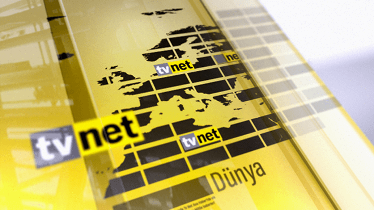
As part of the news ticker, the logo also served as the baseline and starting point of the whole screen, and a vital part of the news headlines. The lines pulling through the logo just before the news indicated upcoming information.
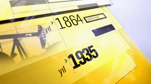
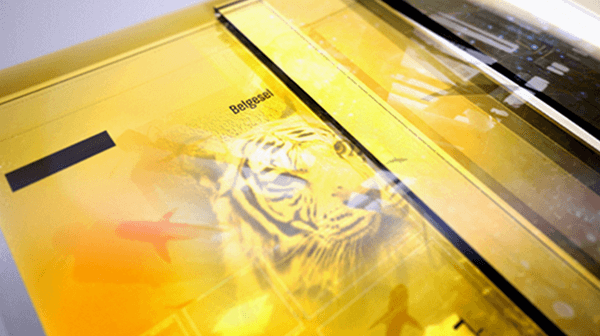
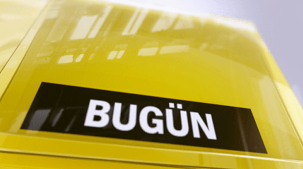
The shiny transparent glass-coated plates, which were also used for 3D opener and bumper versions, were actually built around the idea of a pile of news files. Therefore, we not only added colour, texture and music but also developed a branding for the channel through motion.



 More Projects
